In this article, I will explain several types of charts used for visualizing data. Data visualization requires transforming raw numbers into visuals which can be analyzed and understood quickly.
When presenting different types of information such as trends, comparisons, or distributions, one has to be careful on selecting the right chart. In this article, I explain different chart types and discuss their effective use in context.
Key Points & Different Types of Charts List
| Chart Type | Key Point |
|---|---|
| Heatmap | Uses color intensity to represent data values across two dimensions. |
| Bar Chart | Displays categorical data using rectangular bars for easy comparison. |
| Line Chart | Shows trends over time with connected data points using lines. |
| Pie Chart | Represents proportions of a whole using slices of a circle. |
| Scatter Plot | Plots points to show relationships or correlations between two variables. |
| Histogram | Displays the distribution of numerical data using adjacent bars. |
| Area Chart | Emphasizes magnitude of change over time with filled areas under lines. |
| Bubble Chart | Like a scatter plot but with varying bubble sizes to represent a third value. |
| Radar Chart | Compares multiple variables on a radial scale. |
| Tree Map | Uses nested rectangles to show hierarchical data and proportions. |
10 Different Types of Charts
1.Heatmap
A heatmap is a graphical representation of data where the individual values are represented in a matrix as colors. The color of each box represents the value of the data, allowing quick identification of trends, outliers, or patterns. Heatmaps are frequently used in genomics, correlation matrices, and web traffic analysis.
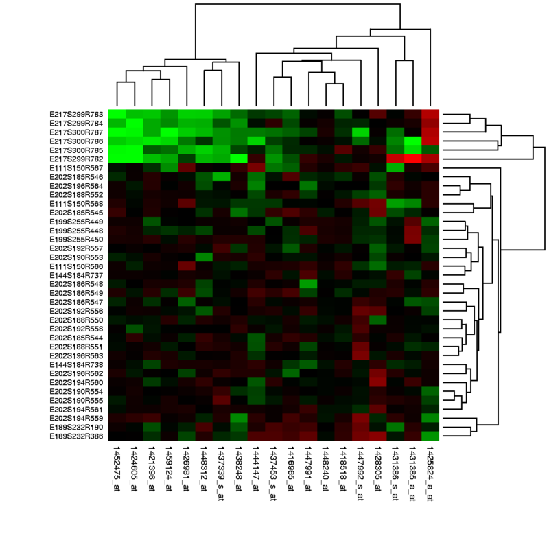
They are particularly useful for simplifying sophisticated datasets visually, especially large volumes of data—overwhelming if presented numerically. Heatmaps help spatially organize data about high or low activity areas, making them valuable in exploratory data analysis.
| Feature | Description |
|---|---|
| Color Intensity | Represents data magnitude through varying colors or shades. |
| Two-Dimensional Layout | Displays data across two variables or categories simultaneously. |
| Pattern Recognition | Helps quickly identify trends, clusters, and outliers visually. |
| Large Data Handling | Suitable for representing large datasets compactly. |
2.Bar Chart
A bar chart is a graphical representation of data that uses rectangular bars to display and compare different categories. Quantities for various groups can be visually compared as their values are represented proportional to the length or height of bars.
Horizontal and vertical bar charts are frequently utilized for discrete data such as survey or sales figures categorized by type.
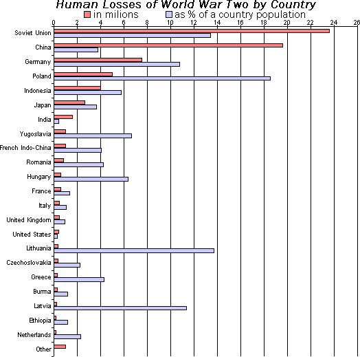
They provide an uncomplicated method of illustrating differences among categories, trends over time (with grouped bars), or relative performance. They are widely used in business for reporting, presentations, or visualization of academic data due to their clear simplicity.
| Feature | Description |
|---|---|
| Categorical Comparison | Compares different categories side by side. |
| Vertical or Horizontal Bars | Bars can be oriented vertically or horizontally. |
| Easy to Interpret | Simple visual for quick understanding of differences. |
| Grouped or Stacked Variants | Supports multiple datasets in grouped or stacked bars. |
3.Line Chart
Data points across a measurement interval, often time, may use straight lines to form connected clusters, which is a line chart. It is best for observing data trends, progression, and any changes with time.
Each moment data value is captured as a point along the line which helps track fluctuations, cycles, or long-term movements. Line charts are frequently used in financial analysis, weather trend observations, and scientific data.
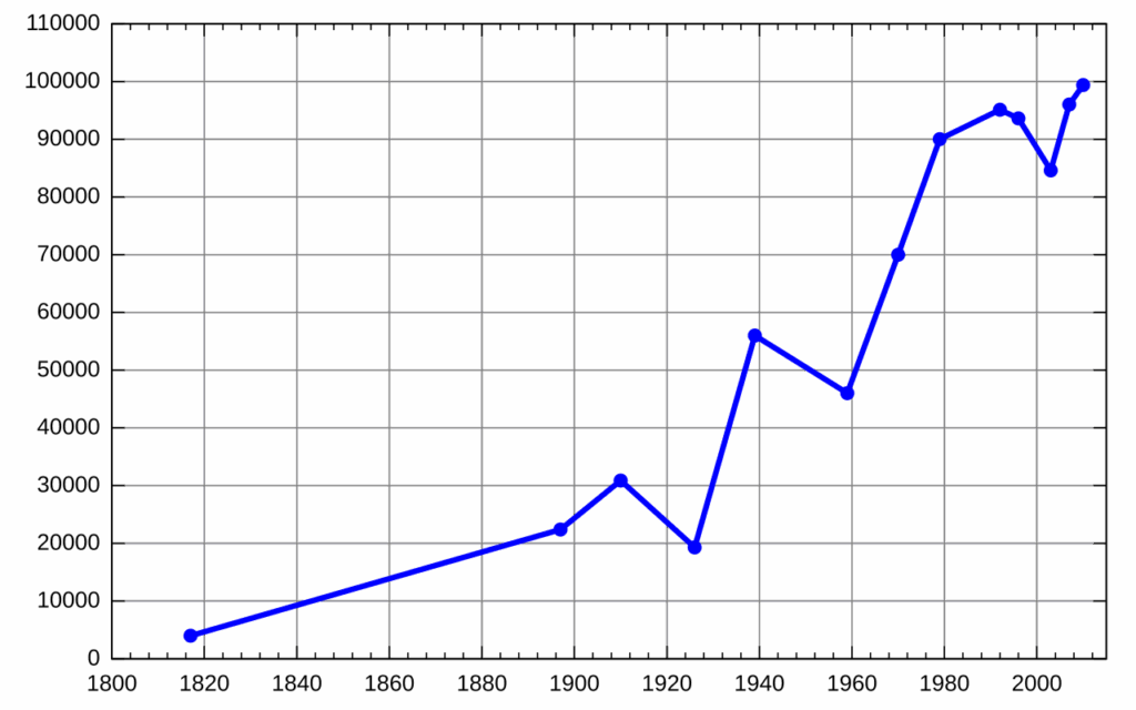
They can include multiple lines for comparison of several datasets. As with most charts, line charts are clear exposing useful patterns which can reveal correlations and be used for forecasting or monitoring real time changes in dashboards.
| Feature | Description |
|---|---|
| Trend Visualization | Shows data changes and trends over time or continuous variables. |
| Multiple Series Support | Can display several lines for comparison. |
| Data Points Connected | Lines connect points to emphasize progression. |
| Ideal for Time Series | Commonly used for time-based data analysis. |
4.Pie Chart
A pie chart is a circular graph that is divided into slices to show parts of a whole. The size of each slice indicates the percentage or share of that category in relation to the total dataset.
Pie charts are best for simple comparisons and enable one to see which segments are larger or smaller. Although eye-catching, pie charts are most effective with five categories or less to prevent clutter.
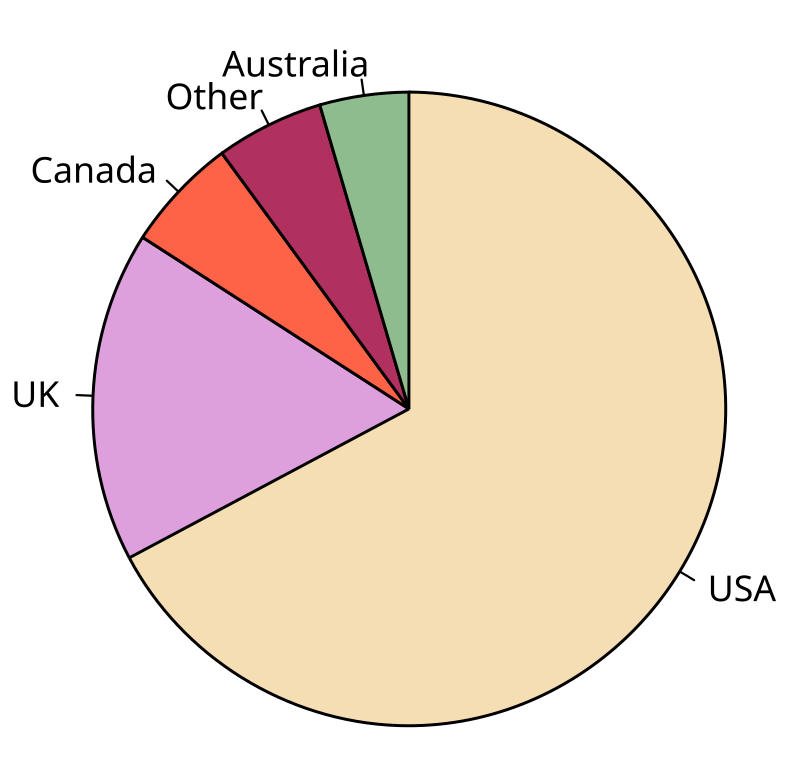
They are widely used in business and the media to display market share, budget breakdowns, or survey results. Compared to bar charts, they provide less precision for detailed comparisons.
| Feature | Description |
|---|---|
| Proportional Representation | Displays parts of a whole as slices of a circle. |
| Visual Simplicity | Easy to understand proportions visually. |
| Best with Few Categories | Works best with limited data slices to avoid clutter. |
| Color Coded Segments | Different colors differentiate slices. |
5.Scatter Plot
A scatter plot is a graph made up of dots representing two variables tested on the X and Y axes. Each dot on the graph represents a value and illustrates an observation which can be analyzed for relationships, trends, or even outliers.
Scatter plots are particularly useful when one variable depends on the other, like in the case of height and weight or temperature and energy consumption. If a scatter graph shows points that are close to a line or a curve, it may indicate a linear or non-linear relationship.
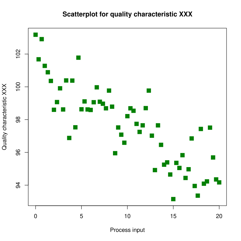
Scatter plots, often enhanced with trend lines or color coding, are frequently used in statistics, science, and economics. They are a powerful tool for exploratory and predictive data analysis.
| Feature | Description |
|---|---|
| Two-Variable Data Plotting | Shows relationship between two quantitative variables. |
| Individual Data Points | Each point represents an observation. |
| Correlation Detection | Reveals patterns, clusters, or outliers. |
| Option for Trend Line | Can include regression or trend lines for analysis. |
6.Histogram
A histogram displays the distribution of a continuous variable by segmenting data into intervals, known as bins, and using adjacent bars to depict the frequency of occurrences in each bin. Unlike bar charts, histograms work with ranges as opposed to categories.
They ascertain the shape of the data distribution such as normal, skewed, or uniform and uncover tendencies like central tendency, variability, or outliers.
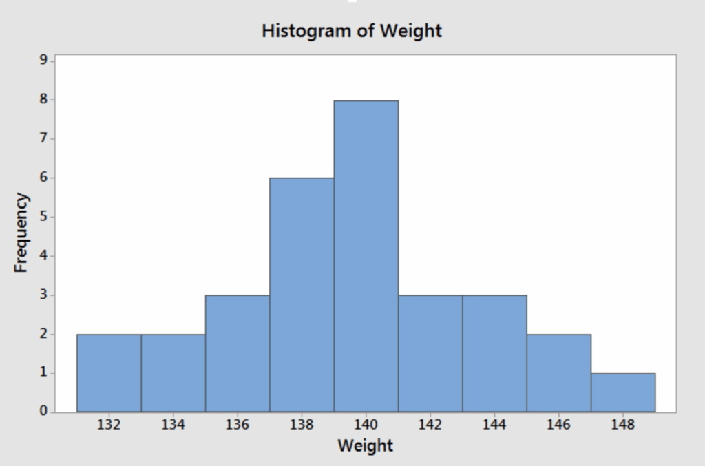
Histograms have applications in the fields of statistics, quality control, and engineering. They are great for revealing the structure of data such as in test scores or measurement data and assessing processes in science and engineering.
| Feature | Description |
|---|---|
| Frequency Distribution | Shows how data values are distributed across intervals. |
| Continuous Data Representation | Uses bins to group numerical data ranges. |
| Adjacent Bars | Bars touch to emphasize data continuity. |
| Identifies Data Shape | Highlights skewness, modality, or normality. |
7.Area Chart
An area chart is a line chart with the space below the lines filled with color or shading. It highlights the volume of data emphasizing cumulative totals or part-to-whole relationships over time.
Area charts are particularly effective in monitoring changes across several categories, as the layers stack and show how each segment contributes to the total.
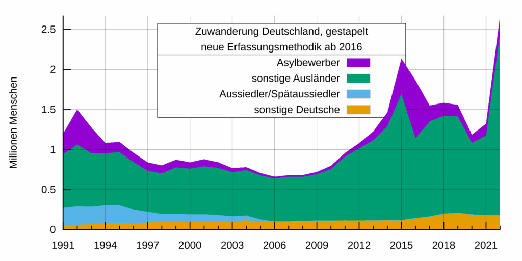
While they are useful to compare overall trends and focus on the extent of values, they may also become cluttered with too many data series. Area charts are often used in finance and business, as well as environmental monitoring.
| Feature | Description |
|---|---|
| Filled Area Under Line | Emphasizes volume or magnitude over time. |
| Multiple Layer Stacking | Supports stacked areas to show part-to-whole relationships. |
| Trend and Magnitude Display | Combines trend line with total quantity visualization. |
| Visual Impact | Highlights cumulative changes effectively. |
8.Bubble Chart
A bubble chart is just like a scatter plot but with a third dimension added—size. A bubble corresponding to each data point is placed according to two variables (X and Y axes), and size of the bubble indicates the third variable. More than one set of data can thus be visualized in a single chart.
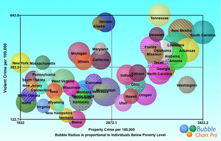
Bubble charts are useful for identifying patterns, outliers, and relationships involving three variables. They are frequently used in Economics, Marketing, and Data Science while investigating questions like in-depth market analysis, resource allocation, or customer segmentation. It gives additional value compared to standard charts.
| Feature | Description |
|---|---|
| Three-Variable Visualization | X and Y axes plus bubble size for third variable. |
| Data Point Size Variation | Size encodes an additional quantitative variable. |
| Multidimensional Data Insight | Shows complex relationships in one chart. |
| Useful for Market or Demographic Analysis | Reveals clusters and outliers visually. |
9.Radar Chart
Radar charts (also called spider or web charts) are helpful for showing multivariate data across multiple dimensions. In these charts, data points for each dimension are connected to form a polygonal shape.
Each dimension has an axis protruding the center of the chart. In sports, product evaluations, or even skill assessments, radar charts are extremely useful for comparing several items or performance metrics as they provide a quick visual indication of relative strengths and weaknesses.
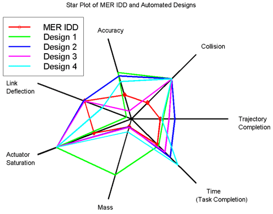
Although radar charts can be helpful and visually intuitive for relative comparisons, too many data series and overlapping polygons make them difficult to interpret. Radar charts are best when used with consistent scales and a small number of dimensions.
| Feature | Description |
|---|---|
| Multivariate Comparison | Displays multiple variables on radial axes. |
| Polygon Shapes | Connects data points to form a polygon representing performance. |
| Highlights Strengths & Weaknesses | Easy visual of relative values across categories. |
| Useful for Skill or Feature Assessment | Compares different entities across many criteria. |
10.Tree Map
A tree map shows data in the form of nested rectangles, and each rectangle symbolizes a branch in data hierarchy. Each rectangle is scaled proportionately to a specific metric and can be colored to represent categories or additional metrics.
Tree maps are the best at visualizing part-to-whole relationships within large datasets, for example sales by department or file sizes in a directory.

They are space-efficient and reveal proportional relationships clearly. However, they become hard to read when rectangles get too small or there are too many categories. Ideal for dashboards and overview snapshots.
| Feature | Description |
|---|---|
| Hierarchical Data Display | Shows nested relationships through rectangles. |
| Size Proportional to Value | Rectangle area represents quantitative data size. |
| Color Coding | Colors often represent categories or additional metrics. |
| Space Efficient Visualization | Displays complex datasets compactly in a small area. |
Conclusion
In summary, various visualization aids streamline intricate details, making data easier to understand. As an example, heat maps indicate patterns, line charts depict trends, and pie charts illustrate proportions.
Each of these charts comes with its own set of unique strengths. The most efficient visualization approach hinges on the analysis at hand and the intent behind it. Accurate data representation will lead to thorough understanding and powerful analysis.
FAQ
What is the best chart to show data trends over time?
Line charts are ideal for displaying trends over time, showing how data values change continuously.
When should I use a bar chart?
Use bar charts to compare values across different categories clearly and easily.
What is the main purpose of a pie chart?
Pie charts are used to show parts of a whole, making them suitable for displaying proportions.


