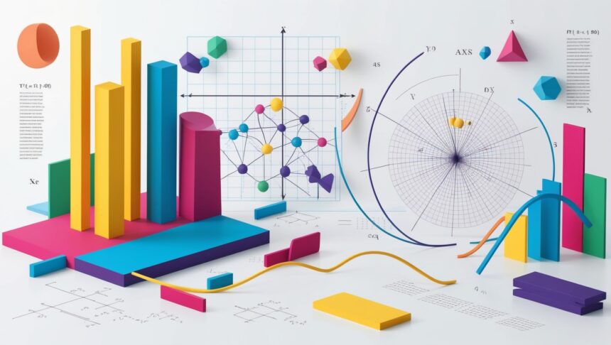
Different Types of Graphs in Mathematics Graphs are the go-to tools we use when we want to make numbers pop off the page. Instead of sliding through rows of figures, a single bar or slice can show a story at a glance.
Line graphs trace changes over time, bar graphs stack comparisons side by side, pie charts chop the whole into tasty wedges, and scatter plots scatter points like stars across a night sky. Knowing when to pick each style sharpens both our math skills and the way we share what we find.
What Are the Different Types of Graphs in Mathematics?
Graphs make math feel a little less like guesswork and a lot more like seeing the big picture. The lineup is pretty familiar: a line graph traces ups and downs over time; a bar graph stacks one group beside another.

A pie chart slices a whole into tasty-looking wedges; a scatter plot dots data points all over to spot trends; and a histogram stands tall to show how many fall into each bucket. Pick the right style, and suddenly messy numbers turn into a story everyone can follow.
Choosing the Right Graphs in Mathematics?
Know What You’re Looking At : Before you even open a charting app, ask yourself if the data is a tidy list of categories, a pile of numbers, or something that flows like temperature over time.
Pick a Goal and Stick With It : If the mission is to spotlight rising sales, a line graph shines. For a head-to-head showdown, nothing beats a bar graph. Want to show how a single cake is sliced? Then a pie chart does the job.
Mind Who’s Looking : Friends in the office probably want plain, honest visuals, while a room full of data nerds can handle a spaghetti mess of lines and tiny axis ticks.
Don’t Play Tricks: Stretching the Y-axis or skipping labels might make a bump look like a skyscraper, so keep scales honest.
Make the Main Point Pop: Some graphs highlight outliers beautifully, while others bury them; choose wisely to let your biggest takeaway breathe.
Simplicity Wins: Clean lines, bold labels, and a spare legend are more inviting than a rainbow explosion of colors and grid lines. More stuff on the page usually means more confusion.
Specialized Graphs
Dot Plot
A tidy row of dots that lets you count each score one-by-one. Perfect when your list is short and you want to see clusters at a glance.
Stem-and-Leaf Plot
The data sits in a column while the picture draws itself beside it. This double-duty look shows both the shape of the numbers and each value itself.
Network Graph
Points connected by lines that whisper, I know her, he follows her, they work together. Youll run into these in social media maps, gene charts, or computer circuits.
Box Plot
A quick box marks the middle, and lonely dots peek out to say, Im different. Great for spotting the spread and the oddball cases in a pinch.
Area Graphs: Showing Cumulative Totals Visually
An area graph looks like a line chart thats been colored in, with the space below the line filled in to show how big the numbers really are. Because of that shading, you notice the total at a glance and can see how each piece stacks up against the others.
Unlike a plain line graph, the area chart puts the spotlight on the volume of data, so its hard to miss whether the total is rising or falling. People in finance, demography, or anyone counting resources lean on these graphs because they make overall growth-or shrinkage-very clear without a lot of number-crunching.
Benefits Of Graphs in Mathematics

Simplify Complex Data
Graphs shrink a mountain of numbers into neat bars, dots, or lines that anyone can read at a glance.
Reveal Patterns and Trends
Those shapes on the page show connections, trends, and sudden jumps that might stay hidden in a table.
Enhance Communication
You can tell a story with a chart far faster than you can read long columns of stats.
Aid in Decision-Making
When information is laid out visually, deciding what to do next often feels more obvious.
Improve Memory Retention
People are wired to remember images, so colorful graphs stick in your head longer than plain digits.
Facilitate Comparison
A quick side-by-side look at two lines or bars lets you see which group is larger or growing faster.
Pros & Cons
Pros
Graphs chop complicated numbers into bite-sized pictures everyone can see at once.
A quick glance lets you spot trends, funny outliers, and patterns that pop out of the page.
Bright bars or slick lines turn dry data into something people actually want to look at.
Side-by-side charts let you stack data sets and figure out winners in seconds.
Presenters love graphs because a single slide can shout what a paragraph would whisper.
Cons
If the axes get stretched or squished, the whole story flips upside down in a hurry.
Slicing stats into pie wedges can smooth over the rough bits that really matter.
You still need enough math smarts to follow a dot plot before it starts following you.
Not every number fits neatly into a line; some topics scream for words instead of points.
An overcrowded chart with too many colors leaves viewers guessing what any of it means.
Conclusion
Knowing your way around different math graphs is more than a tidy bonus; its a key skill if you want to really see and make sense of numbers. Line graphs spell out trends over time. Bar graphs strut the differences side by side.
Pie charts slice up proportions so you can almost taste them. Scatter plots and histograms play their own niche roles, each filling a gap the others cant touch. Pick the right look, and the story in your data practically shouts at the reader. Nail that choice, and youll be taking data-backed steps with a lot more confidence.


